
A London based brand with a clear vision. Combining music, fashion and technology to produce exclusive cross-media releases.
Waylynn Wolfe is a fresh London label that bridges the gaps between the worlds of fashion, technology and music. They aim to combine luxury releases with an aesthetic style inspired by team sports-wear and plant life.
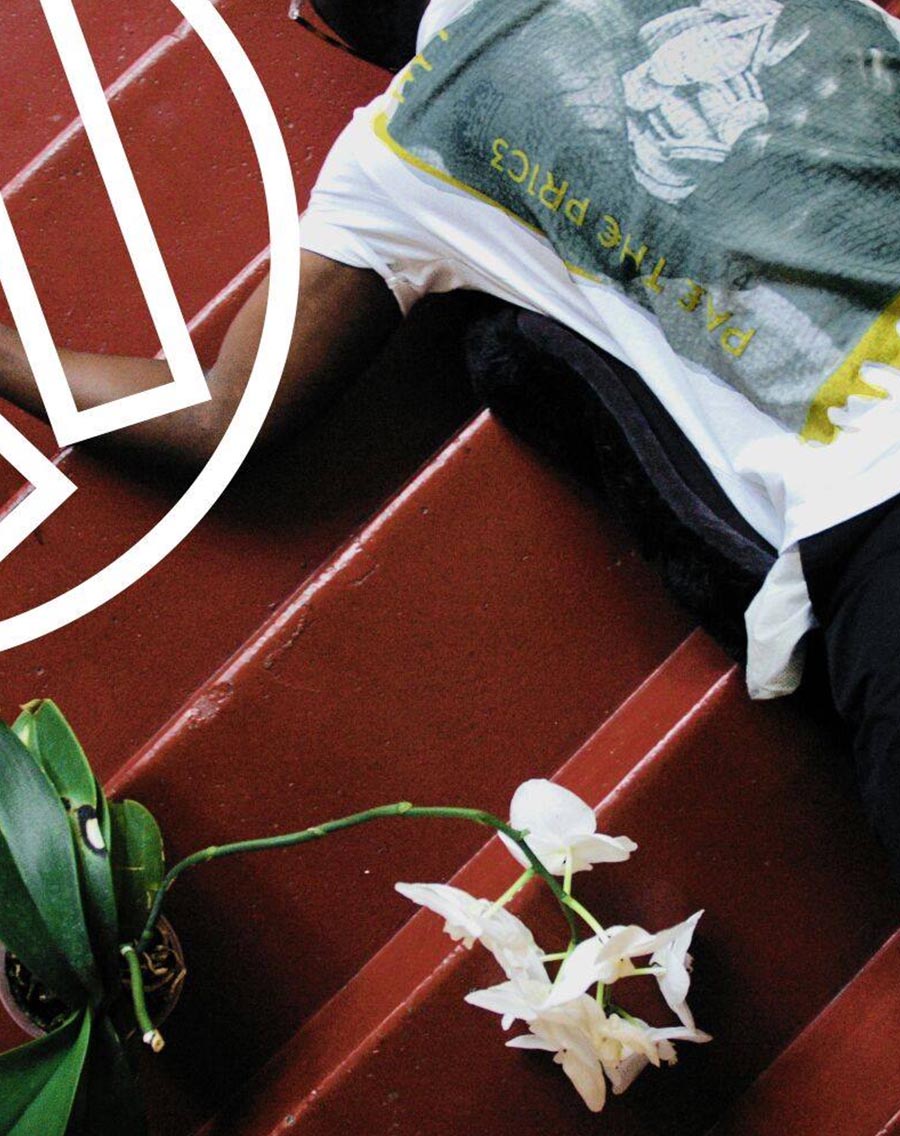
Waylynn Wolfe's flagship act is Mickey Lightfoot, fronted by the enigmatic Osei Amponsa. Their niche sound can best be described as "Avant & Black", drawing from all the blurred lines, cultural exchanges and inter class trade-offs associated with London's vibrant population (check out the Mickey Lightfoot site that we helped makeover and give them a listen).
In the summer of 2016 Osei approached LOUDD to help bring Waylynn Wolfe's brand aesthetic to life, as well as develop an ecommerce site which effectively sells and showcases their offerings.
"Waylynn Wolfe are seeking assistance in building the labels full brand aesthetic and development of an ecommerce web solution.
Ideally our web-site will be based around a Wordpress CMS (content management system) with an integrated ecommerce solution, the solution needs to be as easy as possible to use and update with new products as needed.
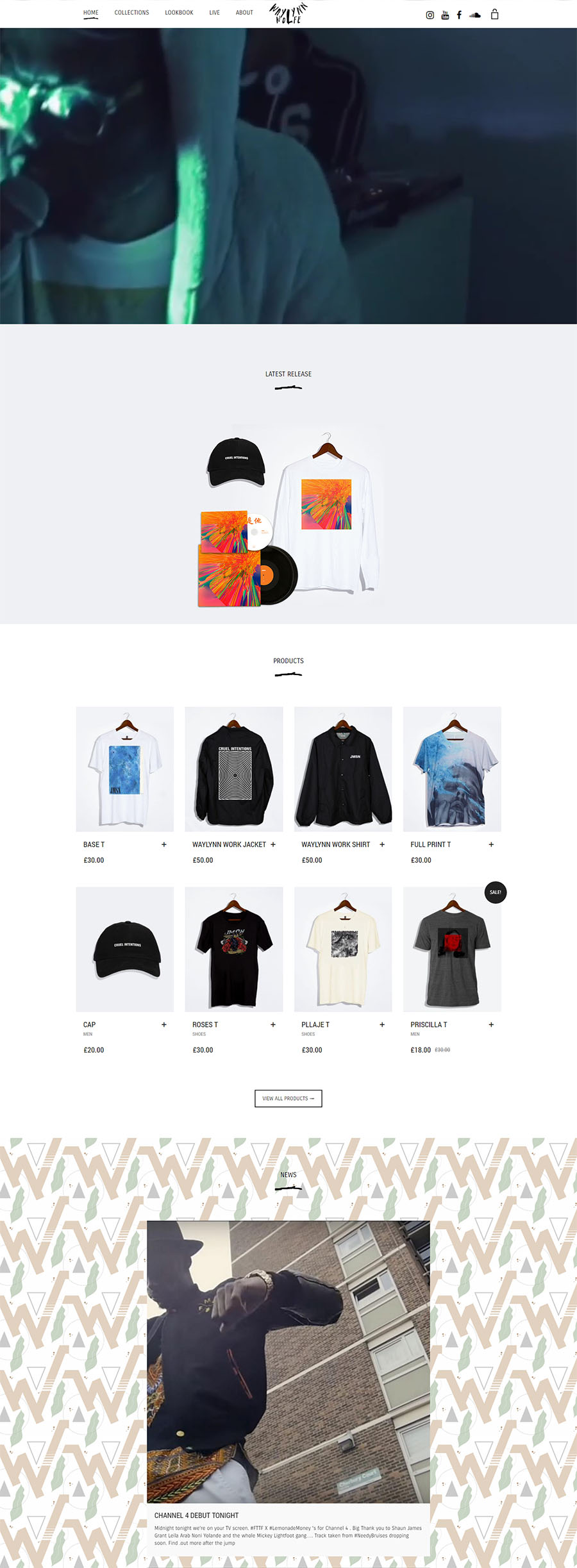
We would like the latest product/welcome image/visual to always be listed first, which will be shaped around each new product bundle - consisting of a tech enabled long sleeve t-shirt, cassette tape, and digital download. Naturally we would like to have the sites SEO on point, as well as have the site ready to implement digital marketing strategies such as trackers, pixels and Google adwords.
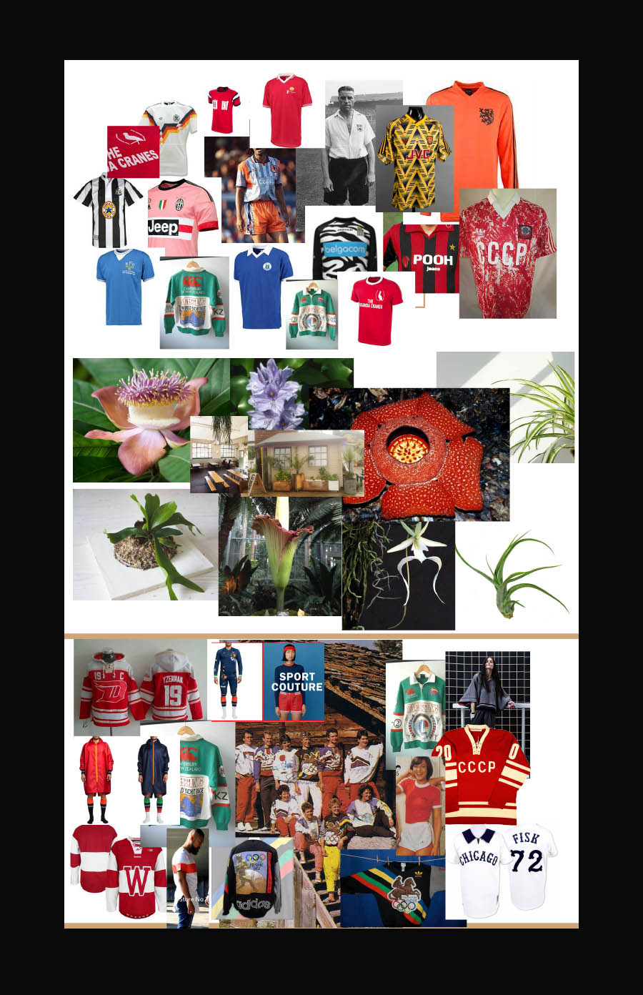
Our Target Audience is eighteen to thirty-five years old. Reads magazines such as i-D, Champ and Hypebeast. Listens to radio stations like NTS and Radar. Are fans of artists such as SBTRKT, FKA TWIGS, Young Fathers, Kanye West, Father, Abra, Gaika and Dean Blunt. We have attached a mood board that should give you some inspiration for the direction to take with aesthetic"
After initial discussions with the Waylynn Wolfe team it was clear they had brilliant ideas, as well as a grand vision for their label and the products that they wish to create. However, an indie label budget offers its own unique set of challenges for an agency trying to help them realise this creative vision.
It became apparent from our conversations that a compromise had to be reached to best use their budget, and that the brand aesthetic was their highest priority. The brief already required the site to have a Wordpress content management system. So after brainstorming with our developers, it was now an obvious choice to integrate a Wordpress e-commerce solution over a much more comprehensive custom alternative. Their shop did not require complex functionality, so this not only met all their needs, but freed up a lot of the budget to focus our attention on iterations of the brand aesthetic.
The development process started with our design team creating wire-frame mock-ups of a potential site layout, once this layout was agreed and signed off by Waylynn Wolfe we set our developers to work on building basics of the site. At the same time our designers were able to focus on the initial aesthetic drafts, which interpreted their brief and drew inspiration from the mood boards provided.


With the supplied mood board and clearly defined influences of team sportswear and plant life, we had plenty to draw from for inspiration.
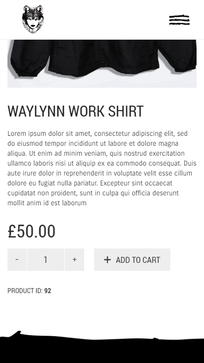
We proposed a clean look for the site with a monochromatic colour palette, and just a few custom built elements to give the site a unique feel. A custom menu icon with an organic look for both open and closed states, and accompanying title decoration in the same style - mirroring the raw vibe of the Waylynn Wolfe wordmark. Carrois Gothic was chosen as the typeface for both headings and body, it’s rigid structure providing balance to the design.
Waylynn Wolfe specified that they wanted a custom built pattern to serve as a background for the blog. Inspiration was taken from 80s and 90s football kits, combined with various forms of plant life to create several different styles of seamless patterns. We explored a few different options, but in the end Waylynn Wolfe opted to use one featuring a stylised ‘W’ with a leaf and some decorative elements.

A promotional video was provided by Waylynn Wolfe, which they wanted featured prominently on the front page. The finished site includes all of our proposed design elements, including a custom footer following the style of the other elements. As a finishing touch, we used the title decoration in the navigation menu too, showing the user what page they are currently viewing.
Lastly, we implemented a custom pop up, prompting users to sign up to the newsletter. This too was styled to match the design of the site
