
Two brands responsible for putting on some of the best live music events in the UK. It's always a pleasure to work on projects that align perfectly with our own passions, and these certainly hit the mark.
Founded in 2007 Bodynod are a Bristol based rave brand, specialising in UK Garage, Grime, UK Funky, Bassline, House and other bass music rave genres. Starting at small intimate venues of 200 capacity, they now put on stages at festivals and regularly fill world renowned Bristol super club Motion. Bodynod has previously played host to some of the biggest names in UK music such as 2016 Mercury Prize winner Skepta, JME, Boy Better Know, Giggs, DJ EZ, MJ Cole and many many more besides.
We love the music Bodynod programs and represents, whether it is the creativity that is coming out of these genres and artists now or the old school classics we listened to when we were growing up. So it was a pleasure for our team to work on this.
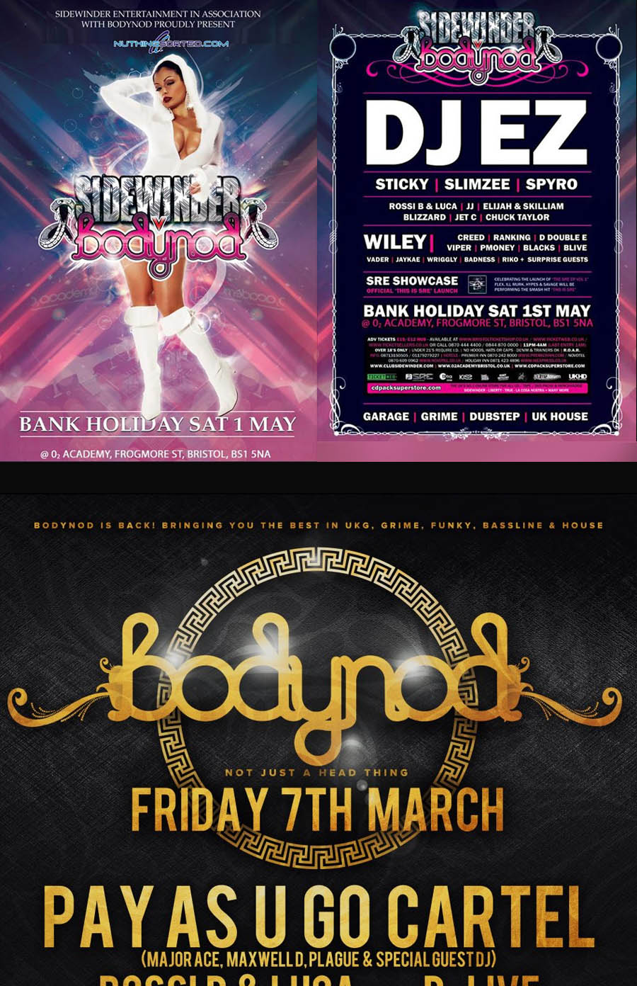
"The Bodynod logo has been the same since 2007. Its style suited that time, with its references back to the bling of the original UK Garage scene and the graphic designers of that era. However, in 2016 we feel it requires a refresh. Although we do think of it more as an evolution rather than a revolution."
Bodynod have also asked LOUDD to create a full brand aesthetic and multi-page website for the very exciting projects they have lined up in 2017, so hold tight for that.

Our first concepts concentrated on the idea of creating a loose yet clean wordmark, incorporating some cursive elements as in the original logo. Bodynod later decided to go in a completely different direction, asking us to create something very clean and minimal. We obliged, exploring hundreds of potential typefaces, and designs, experimenting with the letterforms and lines. These concepts were well received, and it was agreed we would develop some of the ideas further.
Bodynod really liked what we had come up with and were very close to pulling the trigger on the final design, but had a last minute change of heart. Stating that this very clean aesthetic was just too far removed from the existing brand. They asked us to focus again on something a bit closer to the original logo. Sometimes a drastic last minute change can be frustrating, but in this case we were very happy to explore that avenue again. Bodynod is a brand with history and soul. Such a drastically different and comparatively tame logo just didn’t feel right somehow.
Back to our sketchpads we went. Our very first iterations were along the right lines, but we knew we could do better. We analysed, measured and tinkered. Honing our concepts until we found the perfect balance between legibility and flair. We really wanted to retain the distinctive looping elements of the original logo, but had to do so in a way that offered an acceptable level of legibility and strength in the letters.
Rather than work with an existing typeface, we built each letter from the ground up, tailoring the forms to perfectly suit our needs. With tight letter spacing and cursive loops, the logo really needed some additional detail to give it definition and increased legibility. To achieve this we placed indents cutting into some of the letters. This small detail made a huge difference, helping the eye to perceive a natural flow in the letters and establish a sense of direction.
Founded in London in June 2004, iluvlive has become the UK's premier homegrown live music night. They have played a part in launching the careers of artists such as Jessie J, Ed Sheeran, Emeli Sande, Professor Green, Maverick Sabre, Tinie Tempah, Plan B, Chip, Tinchy Stryder, Katy B, Wretch 32 and NDubz, and these are just a few of the acts they have supported, often years before they were signed. With a track record like this, it's no wonder they have been featured in the media everywhere from the BBC to MTV.
They host regular residencies from London to Manchester and all corners of the UK in between. Not to mention music industry showcases and seminars, plus they also somehow manage to fit in running a record label as well!
Some of our team have been to several of their events over the years. They loved the combination of laid back vibes, with signed and unsigned hype backed by what is always a top live band. I guess it's not very often you hear some of these MCs performing this way (it brought back memories of MTV Unplugged apparently).

"After over 10 years we have decided to rebrand as we evolve from a live events company into an artist development organisation focusing on providing support for the future professional recording artists beyond just being a live platform.
The original logo is strong and identifiable but we feel it has a style that is too urban and in an effort to move with the times we want a logo as strong as the original, but also bold, simple and clean."

We explored a few different logo concepts for iluvlive, mostly centred around the central theme of a heart in some form. Upon presenting the first round of concepts, iluvlive said they were happy to go with the wordmark from one of the examples shown. No alterations necessary.
We are used to a little back and forth at this stage, but obviously we had hit the mark, and we were both happy with the selection. Being a fairly rough draft, however, we did insist on tidying up the logo at least. Ensuring the finished product was of the highest possible quality.